
The revised interface in modern MacOS versions including macOS Monterey, macOS Big Sur, MacOS Catalina, macOS Mojave, High Sierra, Sierra, OS X El Capitan, and OS X Yosemite makes heavy use of transparencies, flatness, white space, smaller and narrow fonts, and a dramatic lack of contrast with neutral shades of grey used for most text and many onscreen elements. Combined with the new system font choice of San Francisco or Helvetica Neue (the same font from iOS), the overall look of modern Mac OS is beautifully fancy on Macs with Retina displays, but the ensemble doesn’t always look so great on Macs with normal screens, where the thinness and lack of contrast just ends up looking blurry. Additionally, some users find the Mac interfaces lack of contrast to be challenging to read and interpret.
If you find the newly redesigned interface of MacOS from OS X Yosemite onward to be challenging to read or use, lacking distinction between onscreen elements, or just otherwise distracting, there is a settings choice that improves usability significantly. The result is greatly improved contrast in the user interface, it’s a little retro System 7-ish (for those longtime Mac users this could be a good thing), but the improvements to readability and distinction of interface elements make that a worthwhile endeavor for some users who find the newer interface style to be difficult otherwise. As already mentioned, this is really most useful for users without Retina displays since that’s typically where Yosemite doesn’t look as refined, though of course users with a retina Mac may find the enhanced contrast feature to be an improvement as well.
How to Increase Contrast of Screen Text, UI Elements, & Disable Transparent Effects on Mac
Note that by increasing the contrast you will also disable the translucent screen effects from menu bars and windows.
- Go to the Apple menu and choose System Preferences
- Click on “Accessibility” and select the ‘Display’ panel to the left
- Check the box for “Increase Contrast” (this automatically reduces the transparent effects too)
- Exit out of System Preferences as usual
The effect is instantaneous and fairly dramatic. Most onscreen buttons and user interface elements are suddenly outlined in a dark grey border, and the system font is transformed from the challenging light grey to a darker shade of grey with much greater contrast against its background.
Here’s what the default contrast level looks like in the Accessibility preference panel of Mac OS :

And here’s what the “increased contrast” option looks like in the same preference panel:
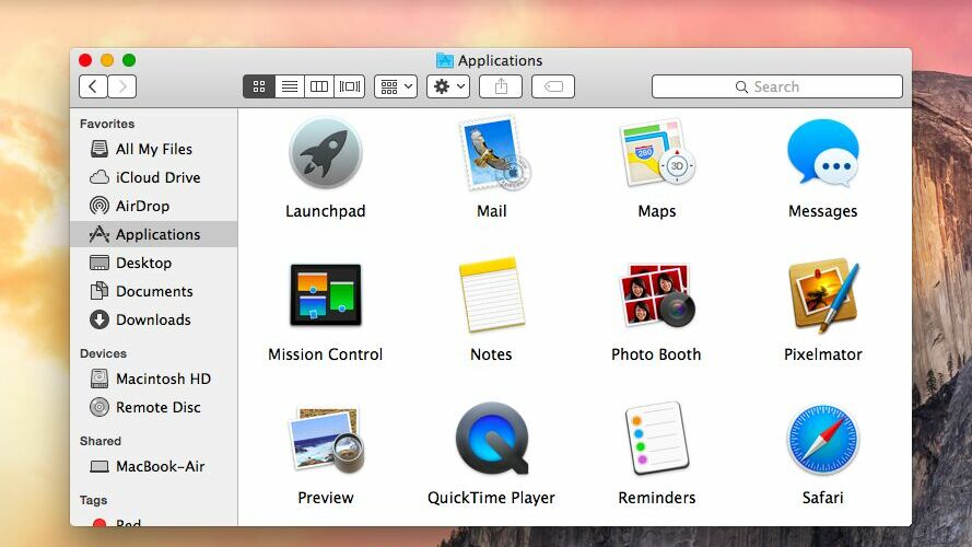
Other user interface elements in MacOS and Mac OS X change quite a bit too. Here’s what the Finder and menu bars look like with the default contrast setting:

And here’s what the same desktop shot of the Mac looks like in Yosemite after the Increased Contrast option is enabled, notice the fonts are darker, sharper, the menu bar is no longer transparent, and the Finder window translucency is turned off:

As mentioned, this also disables all the transparent stuff elsewhere in the menu bars and windows, which further adds to an overall boost in differentiating elements in the user interface of Yosemite. Whether or not you think this is better or worse likely depends on your display type, your eyesight, and personal preferences.
For some users, these seemingly minor user interface changes can be a significant distraction, and potential difficulty reading the newly thinned fonts was one of the primary reasons we cited that some users may want to avoid the Yosemite (or more modern) upgrade entirely. If you’re still not satisfied with the way things look in Mac OS X Yosemite after using the Accessibility options, you can always downgrade back to OS X Mavericks, though that may be a bit extreme for many. Of course all modern macOS releases look this way too, though Sierra and Catalina retained a bit darker of a interface than Monterey and Big Sur which is back to the bright white appearance style of Yosemite.
Remember, you can also submit feedback about Mac OS X directly to Apple using this online form on their website.
Follow Me:
Top Best Sellers!!